Chapter 4 · Python for Data
Charts with Matplotlib
- Page 15 of 23
- 3 min read
A table of numbers hides patterns that a picture makes obvious. You will plot data to understand it before modelling, and plot a model's training progress to see whether it is learning. Matplotlib is Python's standard plotting library; pandas and most other libraries draw with it underneath.
Install with python -m pip install matplotlib. The main module is imported as plt.
The figure and the axes
Every chart is a figure (the whole image) containing one or more axes (individual plots). fig, ax = plt.subplots() creates both; you then call methods on ax to draw. In a notebook the chart appears below the cell; in a script, plt.show() opens a window, and fig.savefig() writes an image file.
A line chart: watching a model learn
When a model trains, it is checked after each pass over the data (an epoch) on the training data and on separate validation data it never trains on. Plotting both is the most common chart in machine learning:
import matplotlib.pyplot as plt

epochs = list(range(1, 11))
train_loss = [2.30, 1.65, 1.21, 0.95, 0.80, 0.70, 0.63, 0.58, 0.55, 0.53]
val_loss   = [2.35, 1.75, 1.36, 1.14, 1.03, 0.98, 0.97, 0.99, 1.04, 1.10]

fig, ax = plt.subplots(figsize=(8, 4.5))
ax.plot(epochs, train_loss, marker="o", label="Training loss")
ax.plot(epochs, val_loss, marker="s", label="Validation loss")
ax.axvline(7, linestyle="--", color="gray")
ax.annotate("validation loss starts rising", xy=(7, 0.97), xytext=(7.3, 1.6),
            arrowprops={"arrowstyle": "->"})
ax.set_title("Training a model: loss per epoch")
ax.set_xlabel("Epoch")
ax.set_ylabel("Loss (lower is better)")
ax.legend()
ax.grid(alpha=0.3)
fig.tight_layout()
fig.savefig("loss.png", dpi=100)
print("Saved loss.png")Saved loss.png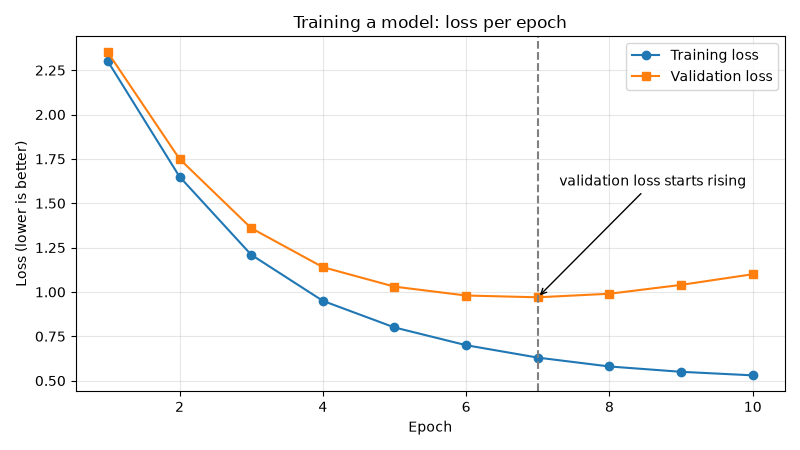
The chart tells a story the numbers hide: after epoch 7 the model keeps getting better on the data it trains on, but worse on new data. It has started memorising instead of learning — overfitting. The fix is to stop training around epoch 7.
Bar charts and histograms
Use a bar chart to compare categories and a histogram to see how values are spread. plt.subplots(1, 2) puts two axes side by side:
import matplotlib.pyplot as plt
import numpy as np

channels = ["chat", "phone", "email"]
avg_minutes = [11.7, 27.5, 65.0]

rng = np.random.default_rng(7)
response_lengths = rng.normal(loc=120, scale=35, size=500)   # words per AI answer

fig, (left, right) = plt.subplots(1, 2, figsize=(10, 4))

left.bar(channels, avg_minutes, color=["#4c72b0", "#dd8452", "#c44e52"])
left.set_title("Average minutes to resolve")
left.set_ylabel("Minutes")

right.hist(response_lengths, bins=25, color="#55a868", edgecolor="white")
right.set_title("Length of 500 AI answers")
right.set_xlabel("Words")
right.set_ylabel("How many answers")

fig.tight_layout()
fig.savefig("bar_hist.png", dpi=100)
print("Saved bar_hist.png")Saved bar_hist.png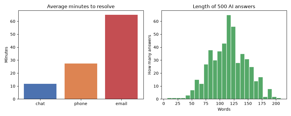
Plotting straight from pandas
A pandas Series or DataFrame has a .plot() method, so a group-by result from the previous page becomes a chart in one call:
import pandas as pd
import matplotlib.pyplot as plt

df = pd.read_csv("tickets.csv")
ax = df.groupby("category")["satisfaction"].mean().sort_values().plot(
    kind="barh", figsize=(7, 3), title="Average satisfaction by category", color="#8172b3"
)
ax.set_xlabel("Satisfaction (1–5)")
plt.tight_layout()
plt.savefig("satisfaction.png", dpi=100)
print("Saved satisfaction.png")Saved satisfaction.png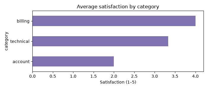
Choosing the right chart
| Question | Chart |
|---|---|
| How does something change over time or steps? | Line — ax.plot |
| How do categories compare? | Bar — ax.bar / ax.barh |
| How are values spread? Any outliers? | Histogram — ax.hist |
| Are two numbers related? | Scatter — ax.scatter |
Every chart you share needs a title, labelled axes with units, and a legend when there is more than one series. A chart someone has to ask about has not done its job.
Try it yourself
- Plot your study hours for the last 7 days as a line chart with labelled axes.
- Make a scatter plot of
minutes_to_resolveagainstsatisfactionfromtickets.csv. What do you see? - Change the loss example so the chart is saved as a PDF instead of a PNG.